Location
Los Angeles, California
Program
Office
Size
13,000 square feet
Dates
1978
Construction Systems
Wood and Masonry
Awards
AIA/LA, Design and Execution, 1979
Photographer
D. Zimbaldi
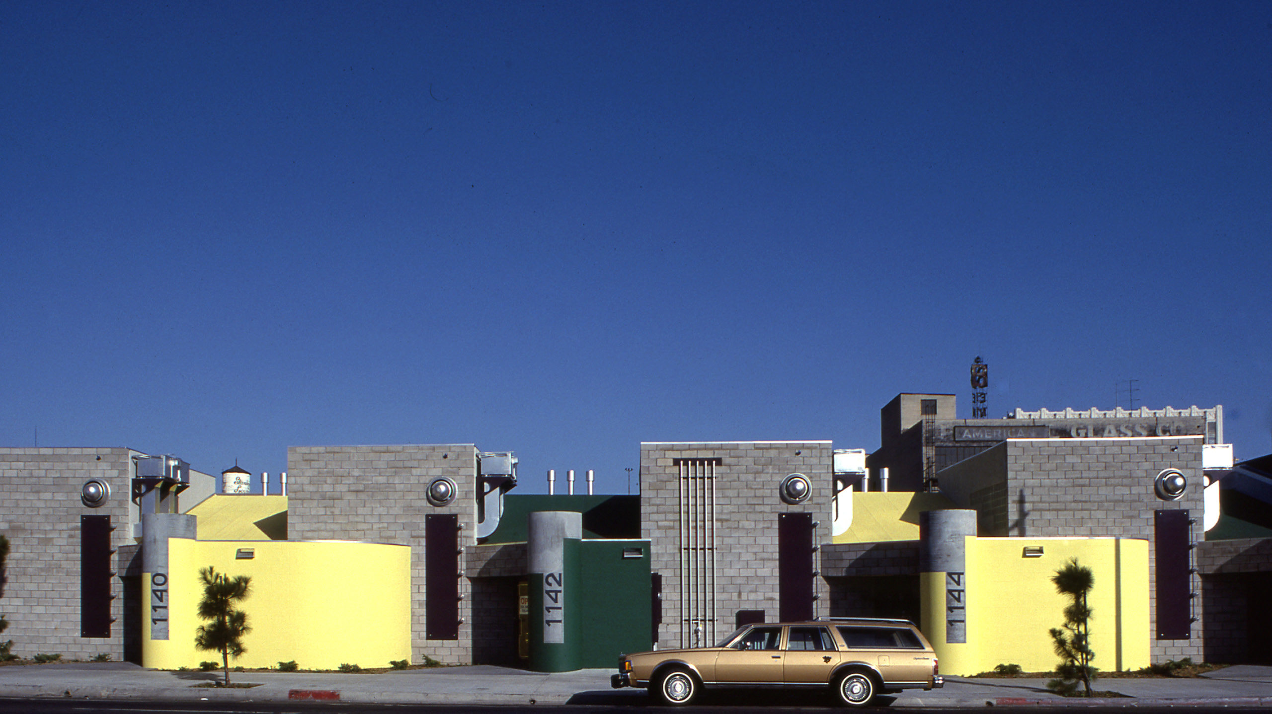
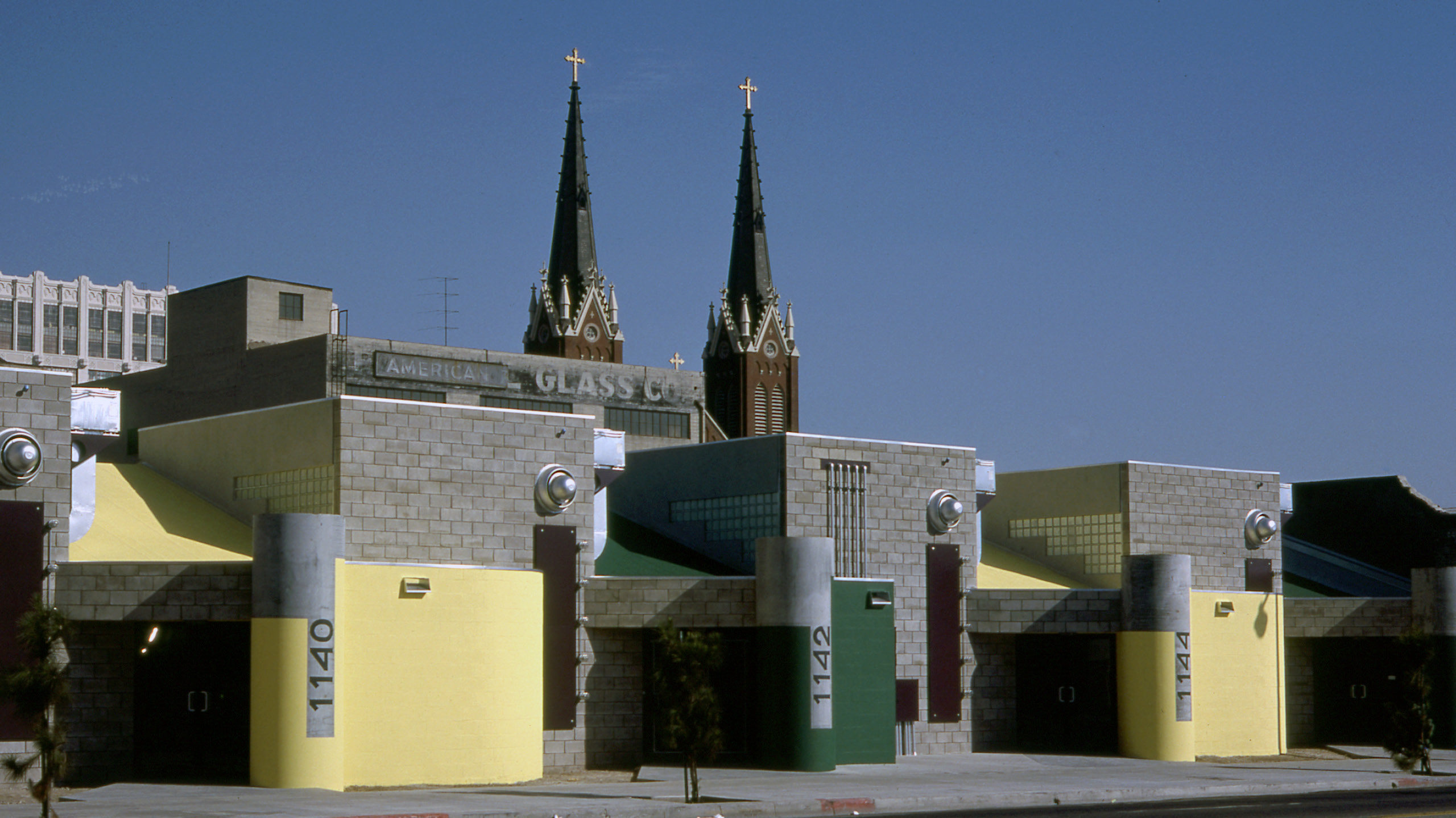
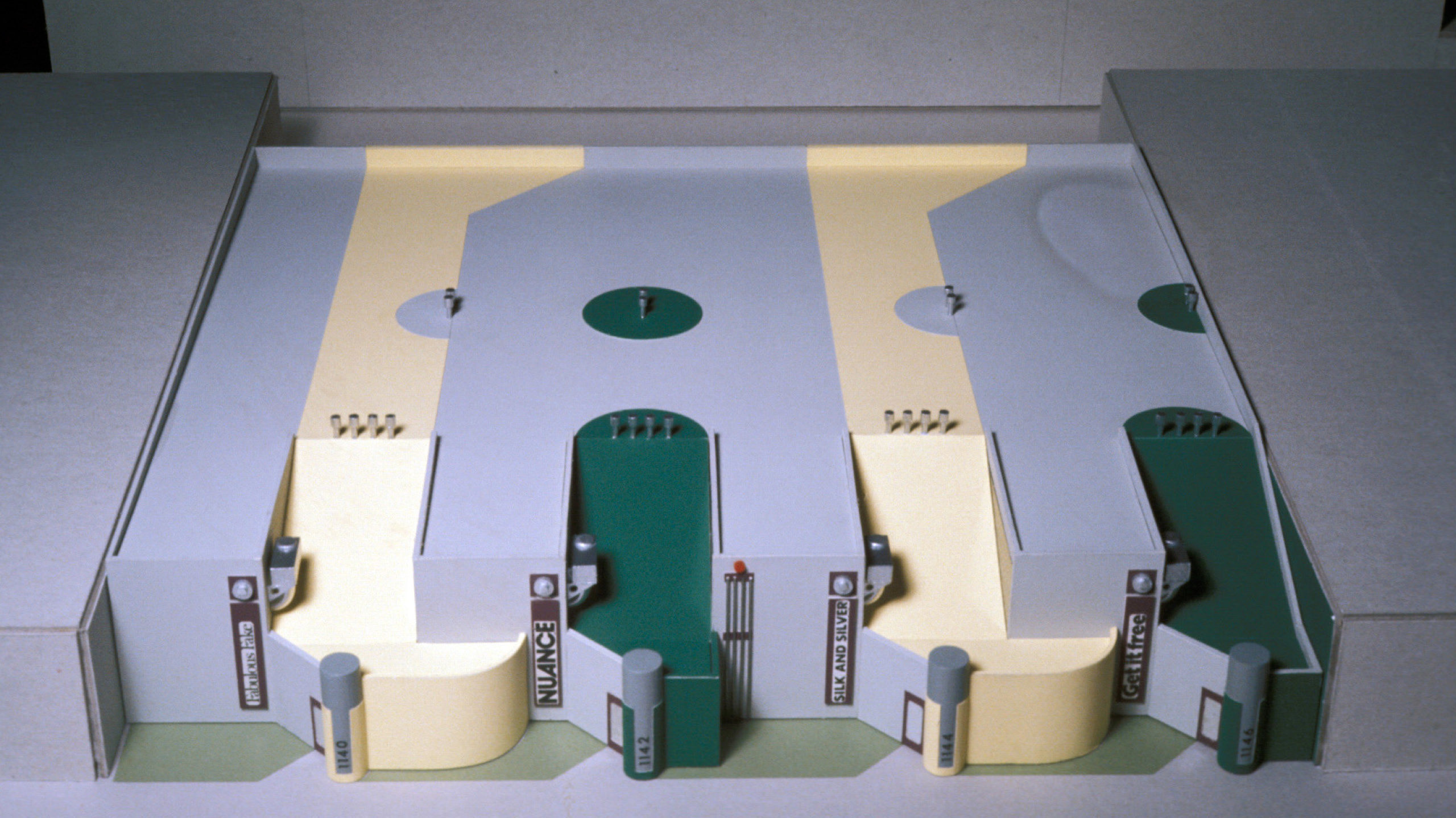
The building provides 13,000 square feet of warehouse and office space for the garment district in downtown Los Angeles.
Buildings in the area containing manufacturing, storage, wholesale, and retails facets of the garment industry were evaluated as program antecedents.
Both existing solutions and prospective tenant needs varied widely, and, additionally, since it was conceivable the building would at some point be turned to other purpose, owner and architect agreed to develop an internally flexible building that could accommodate from one to four rental tenants.
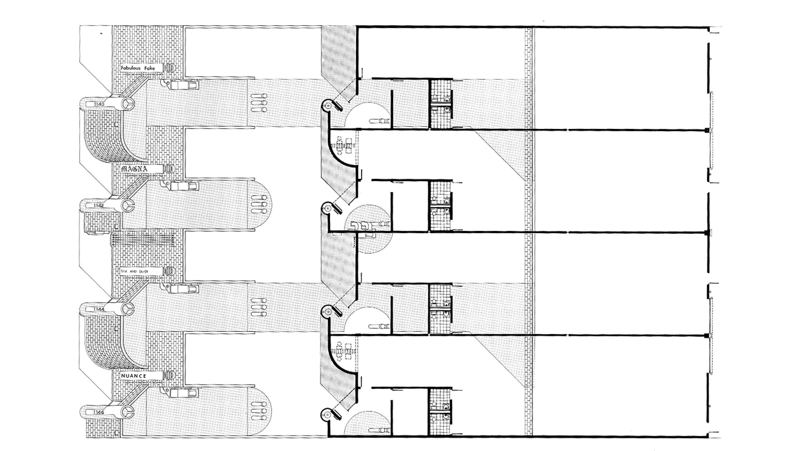
The 120 foot wide site was divided into four 30 foot wide bays, each with 400 square feet of office space and two bathrooms at the front, the remainder to serve as warehousing area (a catch-all for a variety of tenant options, manufacturing, storage, and wholesaling among the most likely).
The 30 foot wide bays were to be sub-divided by metal-stud walls so that, in concept, the square footage requirements, of one, two, three, or four tenants could be accommodated simply by adding or subtracting non-structural walls. (However conventionally rationalized, flexibility here becomes synonymous with an inability to predict programmatic needs, a social comment as well as a design strategy.)
The building sits in an area which is uncertain of its future (though the area is considered by cost-accountants reputedly in the know, to have promising economic future). The site area is physically part of downtown Los Angeles (on its southern border), yet it retains aspects of a residential past (a major church; some wood frame housing), and a garment industry related past and present (a number of single story unreinforced brick sheds, including one either side of the subject site). In addition, a major insurance company headquarters (Occidental) and a local newspaper (Herald-Examiner) are located within a block of the site.
The essence, the feeling of the area is introverted, protective, defensive, a response to the after-hours crime level of a minority neighborhood, and the predictable merchants’ strategy to protect goods and lives with walls and bars.
A fundamental design intention was that the warehouse should formally challenge this introverted, security conscious climate, not as a kind of adolescent harbinger of a rosy social future, but to acknowledge the prospect of an extroverted alternative, a level of enthusiasm (however isolated, perhaps contagious) for the city and the street. That is, the warehouse became a building that solicited reaction. And this would have been the general strategy regardless of the specifics of the building program.
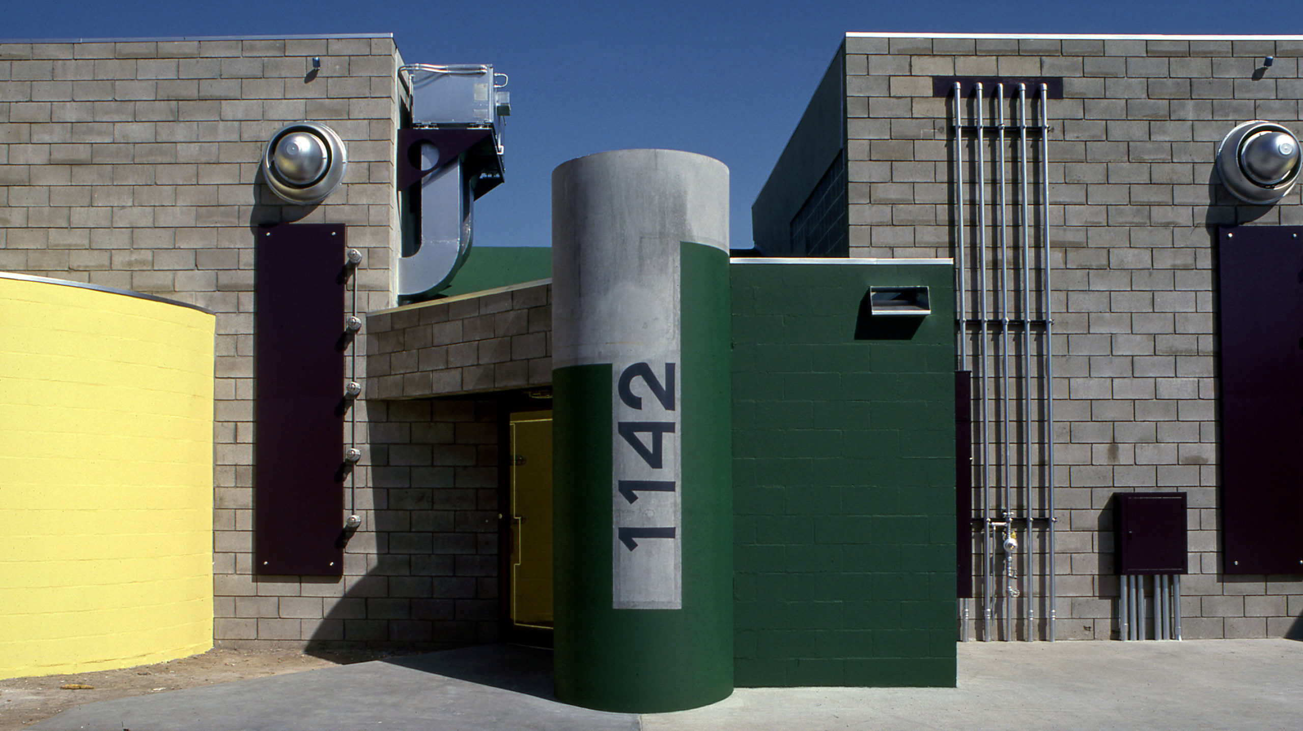
The perimeter walls and two interior shear walls are concrete block. The block is finished in two ways: left as is, (simply waterproofed) with a raked joint; painted, with a flush joint. The intent of the first is to illustrate (in conventional “modern” terms) the nature of the material. But the intention of the second (where the walls appear essentially as single surfaces rather than as compositions of the small units) is to throw into question the attitude of the first. That is, to challenge the dictum (or what remains of it) of expressing materials naturally.
The use of the four pre-cast concrete sewer pipes as signs, as oversized street ballards, intentionally contradicts the ideology that sought to relate configuration to utility. Recognizable as sewer pipes, the cylinders have only a minor (roof drain lines) plumbing function. The possibility of holding hot water heaters inside (concentric shapes) was once considered (a temporary weakness we overcame; in-line water heaters were used instead), but the idea of a resurrected sewer pipe come barber shop pole was always the governing notion.
The roof profile retreats to formal differentiation as related to functional purpose. Low roof – entry; sloping roof – office; high roof – warehouse. These decisions signify intended compromise with the program notion of building as minimum shed with maximum interior flexibility, since the interior heights in office areas are spatially prescriptive, thereby excluding warehousing functions.
The roof itself, as the block walls, represents economy of means. Yet, as with the block (e.g. special radial block, flush joints) the pre-fabricated, panelized roof (glu-lams, 4” x 16”, 2” x 4”, ½” plywood) is intentionally complicated and its cost efficiency diluted by breaking the plain of the diaphragm with the four sloping roofs.
The office areas are heated and air-conditioned; warehouse area is vented with fans attached to the front and rear elevations. Ventilation services, water, gas, and phone lines and equipment along with signs, sign lights, spot lights, and photo-electric cells are hung on the street elevation. The decision to express services in this way does not constitute expression of services as religious dictum. That is, it was done selectively – some services were not expressed; it was not done to assert an architectural principle, but rather both to enjoy and to caricature an existing (if disappearing) one. (In an article for the Los Angeles Times, we labeled this caricature “utility exhibitionism”).
Colors play an intentionally ambiguous role. Ideologically the effort was not to matriculate with either the “school of primary colors” or the “pastel academy.” Colors identify each of the four tenant units. Color distinguishes office from warehouse space on the front elevation. Color partially dismembers the cylinders’ form rendering their identification as simple objects more difficult, while on the same cylinders the (postal) identity of the tenant is indicated.
Sign graphics (a concession to the notion “let the user decide”) are at the discretion of the tenant. The assumption here is that these four graphic efforts will slightly undercut the building’s formal ideology – (an act of self-depreciation?).
Efforts to stylize the interiors were minimized. Other than to align conduit and organize services, the interior is well prepared to indulge a wide range of tenant nuances (and it has).
The roof represents a final element of purposeful ambiguity. Why, with a limited budget, would someone paint a roof? (Why, in fact, with an unlimited budget?).
The roof graphics, in more conventional terms, are a map, a means to locate additional mechanical equipment (space heater vents, heating/air-conditioning units) as they are added.
The roof colors also serve as a continuation of the graphic ribbons (from the elevations) about the box – wrapping and tightening the pieces. And the roof graphics solicit reaction from those who inhabit the office towers that overlook the building. (The roof has been quite successful in this endeavor, and has occasioned a number of visits from enthusiastic neighbors requesting an explanation). Workers in the Occidental Towers have labeled the roof the “Italian Board Game.” Clearly, they have understood the game aspect.
The roof should also be recognized for its quasi-religious contribution as it relates to the Peruvian plains of Nazga (i.e., it must be intended for someone on high since it is unintelligible from the ground). Zeus, perhaps?